Dashboards


Dashboards |
|
| Compliance > Analytics |
A dashboard is a set of one or more panels organized and arranged into one or more rows. Analytics ships with a variety of Panels. Analytics makes it easy to construct the right queries and customize the display properties so that you can create the perfect dashboard for your need. OverviewUser Interface
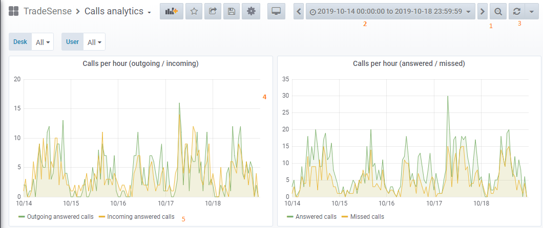
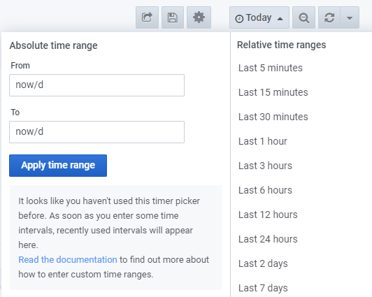
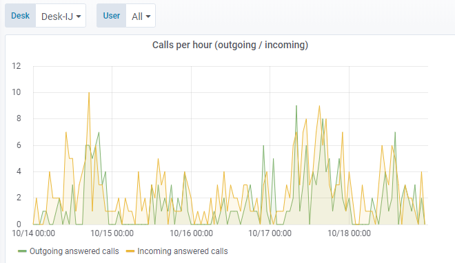
1. Zoom out time range 2. Time picker dropdown. Here you can access relative time range options, auto refresh options and set custom absolute time ranges. 3. Manual refresh button. Will cause all panels to refresh (fetch new data). 4. Dashboard panel. Click the panel title to edit panels. 5. Graph legend. You can change series colors, y-axis and series visibility directly from the legend. Header
The image above shows you the top header for a Dashboard.
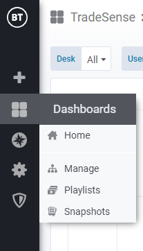
1. Side menubar toggle: This toggles the side menu, allowing you to focus on the data presented in the dashboard. The side menu provides access to features unrelated to a Dashboard such as Users, Organizations, and Data Sources. 2. Dashboard dropdown: This dropdown shows you which Dashboard you are currently viewing, and allows you to easily switch to a new Dashboard. From here you can also create a new Dashboard or folder, import existing Dashboards, and manage Dashboard playlists. 3. Add Panel: Adds a new panel to the current Dashboard 4. Star Dashboard: Star (or unstar) the current Dashboard. Starred Dashboards will show up on your own Home Dashboard by default, and are a convenient way to mark Dashboards that you’re interested in. 5. Share Dashboard: Share the current dashboard by creating a link or create a static Snapshot of it. Make sure the Dashboard is saved before sharing. 6. Save dashboard: The current Dashboard will be saved with the current Dashboard name. 7. Settings: Manage Dashboard settings and features such as Templating and Annotations. Time range controls
The two controls for time visualization are available in the top right: 1. Current time range: This shows the current dashboard time. You can click on it to change it. 2. Refresh interval: This shows the current refresh interval for the current dashboard. You can click on it to change it. This feature is especially useful for always-on displays so that the most recent data is always shown.
These settings apply to all Panels in the Dashboard (except those with Panel Time Overrides enabled) FoldersManage
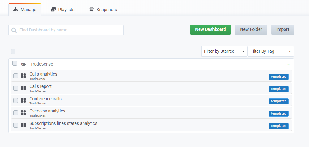
There is a new Manage Dashboards page where you can carry out a variety of tasks:
• create a folder • create a dashboard • move dashboards into folders • delete multiple dashboards • navigate to a folder page (where you can set permissions for a folder and/or its dashboards)
Analytics setup provides a set of dashboards available in TradeSense folder.
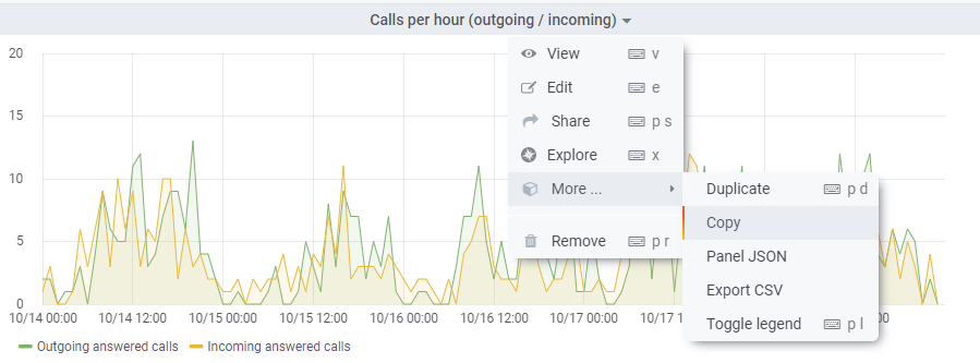
Copy a panelIf you want to copy an existing panel, right-click on the panel’s title to find the copy feature.
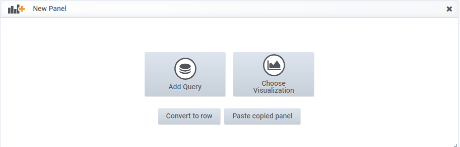
When adding a new panel, you will have the possibility to paste the panel
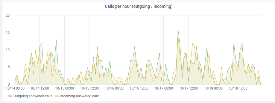
Home dashboardDefault dashboard for the homepage is currently configured on Calls Analytics. If you want to update it, first stare the dashboard you want then go to Configuration > Preferences and change value for the home dashboard preference. PanelsThe main panel in Analytics is simply named Graph. It provides a very rich set of graphing options.
Clicking the title for a panel exposes a menu. The edit option opens additional configuration options for the panel. CustomizationGeneral
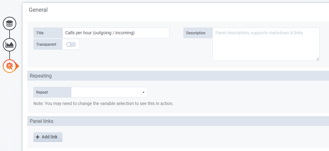
The general tab allows customization of a panel’s appearance and menu options. Info
• Title - The panel title of the dashboard, displayed at the top. • Description - The panel description, displayed on hover of info icon in the upper left corner of the panel. • Transparent - If checked, removes the solid background of the panel (default not checked). Axes
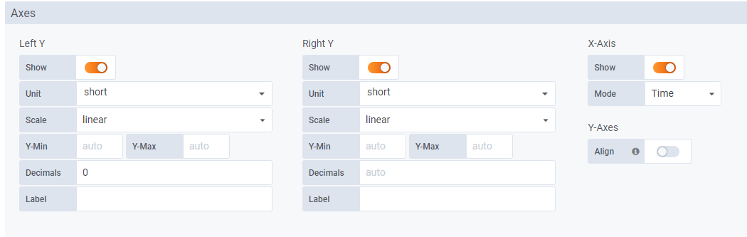
The Axes tab controls the display of axes.
Left Y/Right Y
The Left Y and Right Y can be customized using:
• Unit - The display unit for the Y value • Scale - The scale to use for the Y value, linear or logarithmic. (default linear) • Y-Min - The minimum Y value. (default auto) • Y-Max - The maximum Y value. (default auto) • Decimals - Controls how many decimals are displayed for Y value (default auto) • Label - The Y axis label (default “”) X-Axis
Axis can be hidden by unchecking Show.
For Mode there are three options:
• The default option is Time and means the x-axis represents time and that the data is grouped by time (for example, by hour or by minute). • The Series option means that the data is grouped by series and not by time. The y-axis still represents the value. • The Histogram option converts the graph into a histogram. A Histogram is a kind of bar chart that groups numbers into ranges, often called buckets or bins. Taller bars show that more data falls in that range. Display style
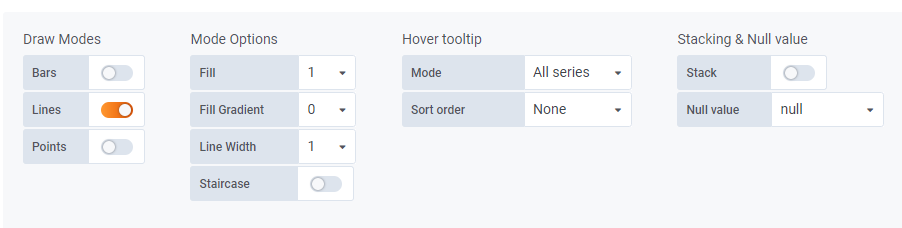
Display styles control visual properties of the graph.
Draw Modes
• Bar - Display values as a bar chart • Lines - Display values as a line graph • Points - Display points for values
Mode Options
• Fill - Amount of color fill for a series (default 1). 0 is none. • Line Width - The width of the line for a series (default 1). • Staircase - Draws adjacent points as staircase • Points Radius - Adjust the size of points when Points are selected as Draw Mode. • Hidden Series - Hide series by default in graph.
Hover tooltip
• Mode - Controls how many series to display in the tooltip when hover over a point in time, All series or single (default All series). • Sort order - Controls how series displayed in tooltip are sorted, None, Ascending or Descending (default None). • Stacked value - Available when Stack are checked and controls how stacked values are displayed in tooltip (default Individual). ◦ Individual: the value for the series you hover over ◦ Cumulative - sum of series below plus the series you hover over
Stacking and Null value
If there are multiple series, they can be displayed as a group.
• Stack - Each series is stacked on top of another • Percent - Available when Stack are checked. Each series is drawn as a percentage of the total of all series • Null value - How null values are displayed Legend
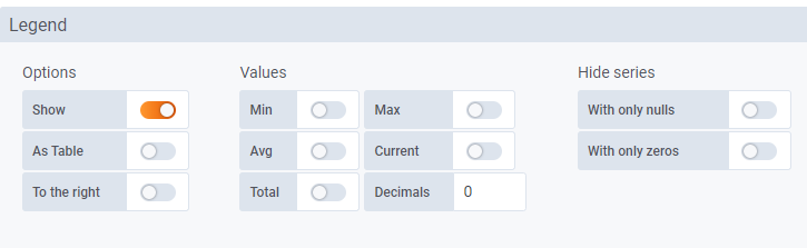
Options
• Show - Uncheck to hide the legend (default checked/true) • Table - Check to display legend in table (default unchecked/false) • To the right - Check to display legend to the right (default unchecked/false) • Width - Available when To the right is checked. Value to control the minimum width for the legend (default 0) Values
Additional values can be shown along-side the legend names:
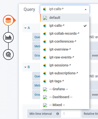
• Min - Minimum of all values returned from the metric query • Max - Maximum of all values returned from the metric query • Avg - Average of all values returned from the metric query • Current - Last value returned from the metric query • Total - Sum of all values returned from the metric query • Decimals - Controls how many decimals are displayed for legend values (and graph hover tooltips) Querying dataAs previously said, Elasticsearch is based on Lucene library. When you’re querying a data source you will have to adapt your query according to search engine standards.
Documentation about Lucene query parse is available from the official website: https://lucene.apache.org/core/2_9_4/queryparsersyntax.html
The Elasticsearch query editor allows you to select multiple metrics and group by multiple terms or filters. Use the plus and minus icons to the right to add/remove metrics or group by clauses. Some metrics and group by clauses haves options, click the option text to expand the row to view and edit metric or group by options. Templating
Variables allows for more interactive and dynamic dashboards. Instead of hard-coding things like server, application and sensor name in your metric queries you can use variables in their place. Variables are shown as dropdown select boxes at the top of the dashboard. These dropdowns make it easy to change the data being displayed in your dashboard.
A variable is a placeholder for a value. You can use variables in metric queries and in panel titles. So when you change the value, using the dropdown at the top of the dashboard, your panel’s metric queries will change to reflect the new value. Interpolation
Panel titles and metric queries can refer to variables using two different syntaxes:
• $varname Example: apps.frontend.$server.requests.count • [[varname]] Example: apps.frontend.[[server]].requests.count Query variable
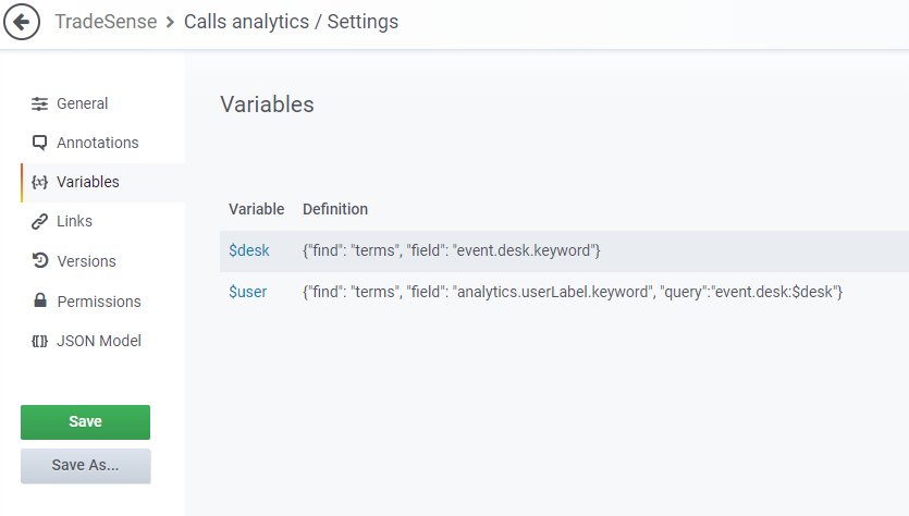
The Elasticsearch data source supports two types of queries you can use in the Query field of Query variables. The query is written using a custom JSON string.
Variable definition are configurated from settings menu of the dashboard
|